House and Exterior Unison
This is an introduction to the new exterior of Mr. M's house in Hachioji City.
The client wanted to decide on the exterior plan first and then create the building to match, so we came up with the design.
In general, after the plan of the house is decided, what to do for the exterior?
However, if you want to create a house that you are particular about, you should think about the exterior, the garden, and the building together, so that you can create a more ideal house.
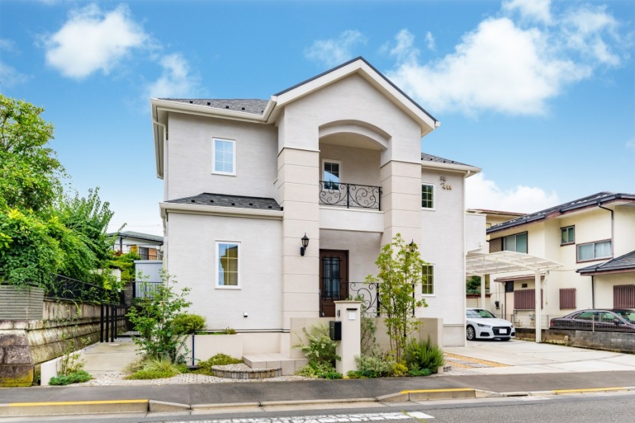
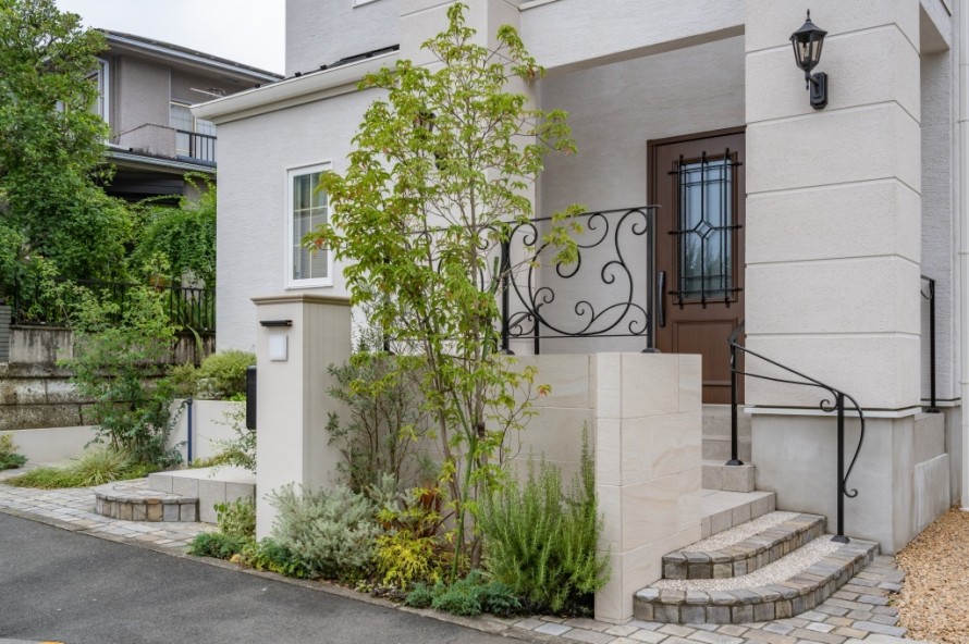
The house has a European style with white as the base color.
A sleeve wall stands in front of the entrance, and the approach splits into left and right from the center.
The client wanted to incorporate this image into the exterior of the house.
The building is also symmetrical, with columns on both sides of the entrance, and custom-made iron ornaments on the second floor and exterior of the building.
By using the same design for both the exterior and the building, the gorgeous curvilinear design creates a sense of unity.
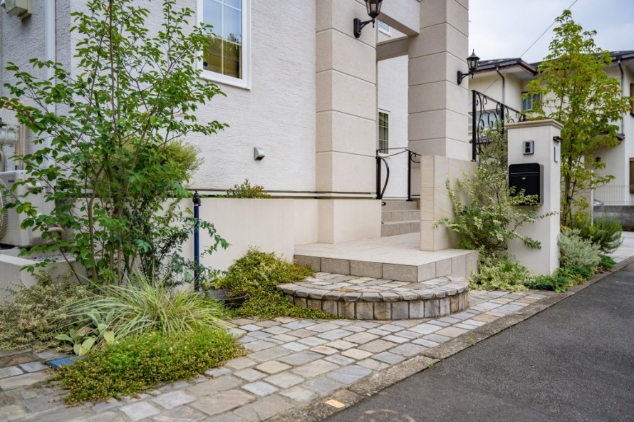
Natural stone was used for the approach pavement.
By using stones with rounded corners and randomly arranging stones of sizes, the approach space has a warm feeling.
This is the gate post and planting space.
The symbol tree is a mountain ash, and the silver carpets are planted next to the corner post.
Silver primrose next to the corner pillar, and cordyline, rosemary, and blue carpet at the foot.
The site is surrounded by lush greenery.
If there are only structures such as square pillars and buildings, they would inevitably have a linear stiffness.
However, by planting greenery like this, a "feeling of softness" is created.
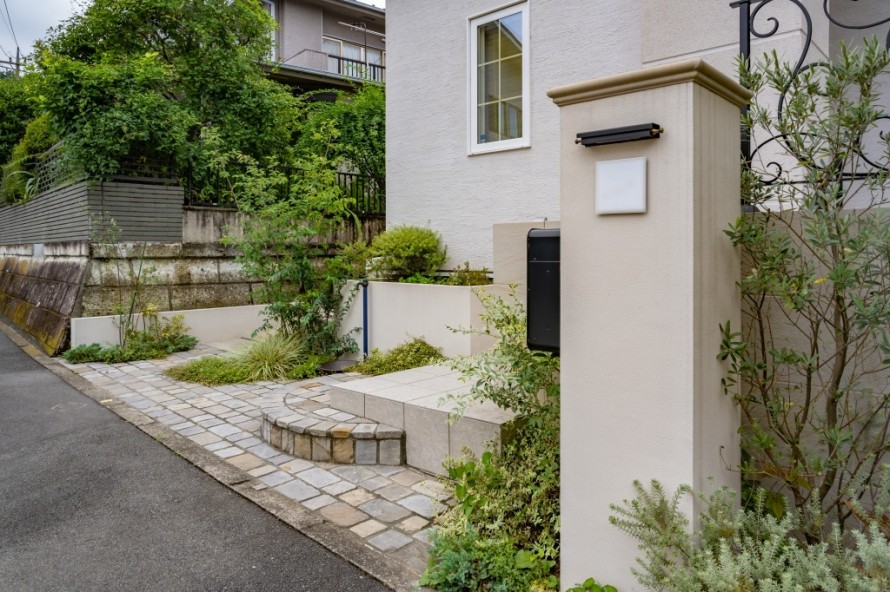
Another angle of the square pillar.
It is a simple structure of paint and shade trees, but it is stylish and has a strong presence.
For the nameplate, we chose soft writing style.
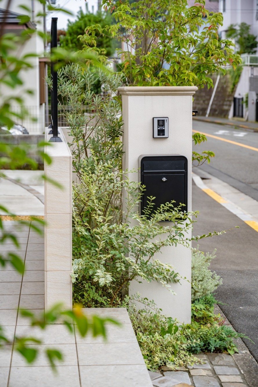
The post and intercom are mounted on the left side of the corner pillar for a neat and tidy design when viewed from the front.
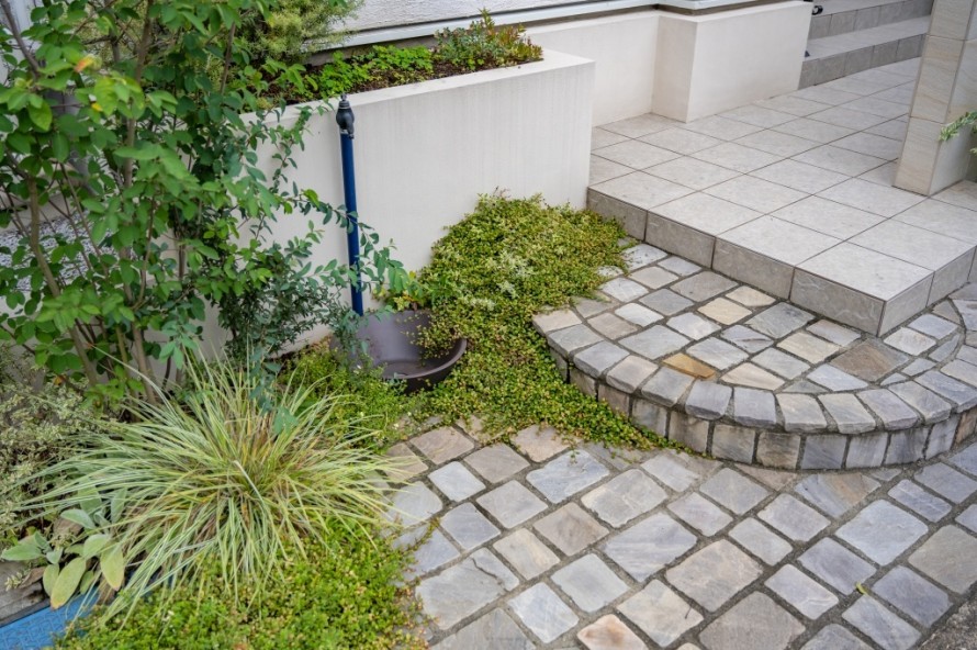
The plants which covered the gaps in the ground are lovely and fuzzy.
The standing water faucet and garden pan in the middle of the approach are also styled to look like objects.
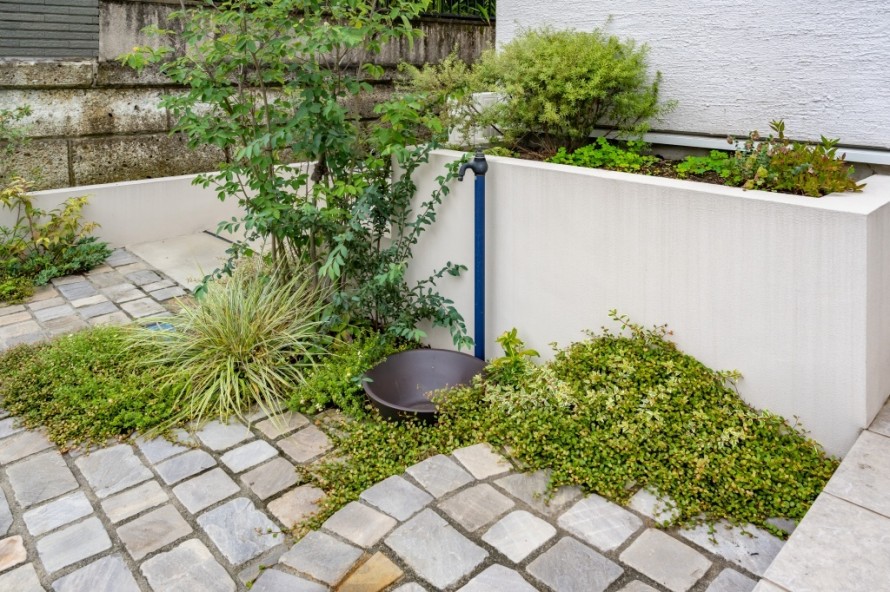
The flower bed also rises up behind the standing water faucet.
With lots of greenery, this is a great space for gardening lovers.
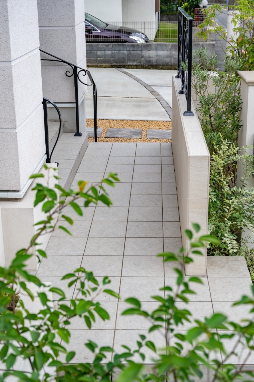
Just before front door, we made a rise and put up an iron decoration.
This is a device to prevent the front of the entrance from being exposed from the road, so that no line of sight can pass through.
The parking lot side and the main approach side are divided into left and right sides.
The pavement is white tiled for simplicity and unity.
Arranging the design of the entrance steps is one of the advantages of planning the house and exterior together.
The design can be reflected while considering the flow line from the approach, such as making the first step wider and matching the color of the tiles.
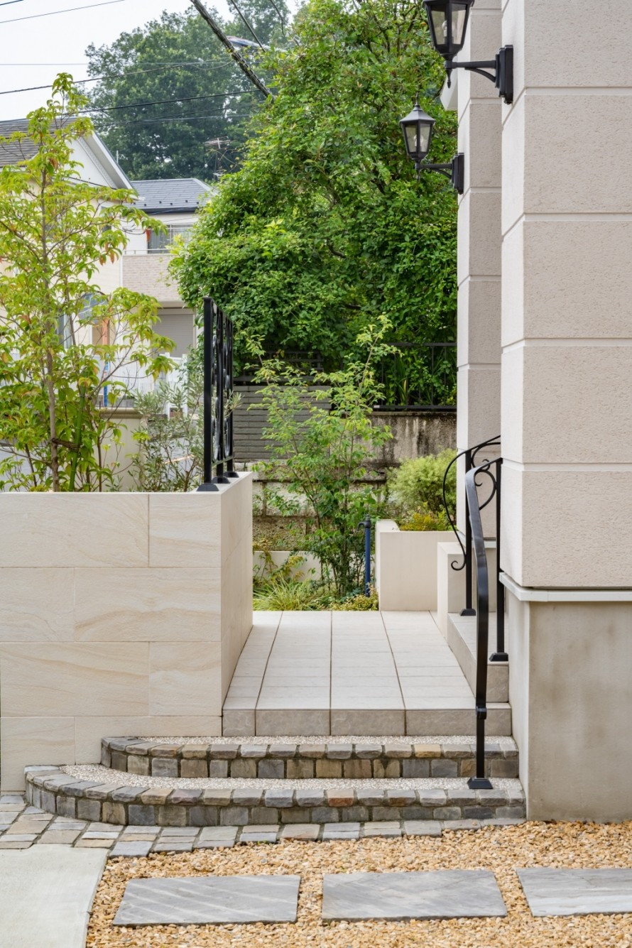
View from the parking lot side.
The parking lot is not paved with concrete on all sides, but instead is covered with decorative gravel and lined with slabs.
It will be a nice looking temporary parking space for visitors to park.
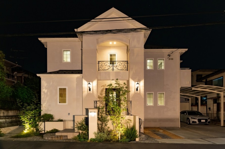
Night view.
The lighting plan took into account the lighting of the building and the light leaking from the windows.
In the exterior, spotlights under the trees and the nameplate lights have been installed.
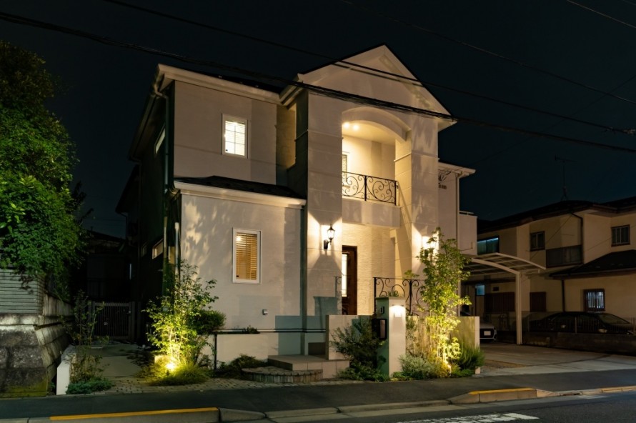
Another angle
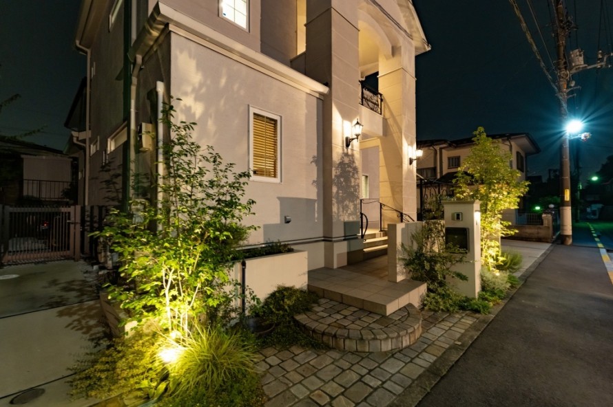
Also another angle….that light is simple but looks great!!!!
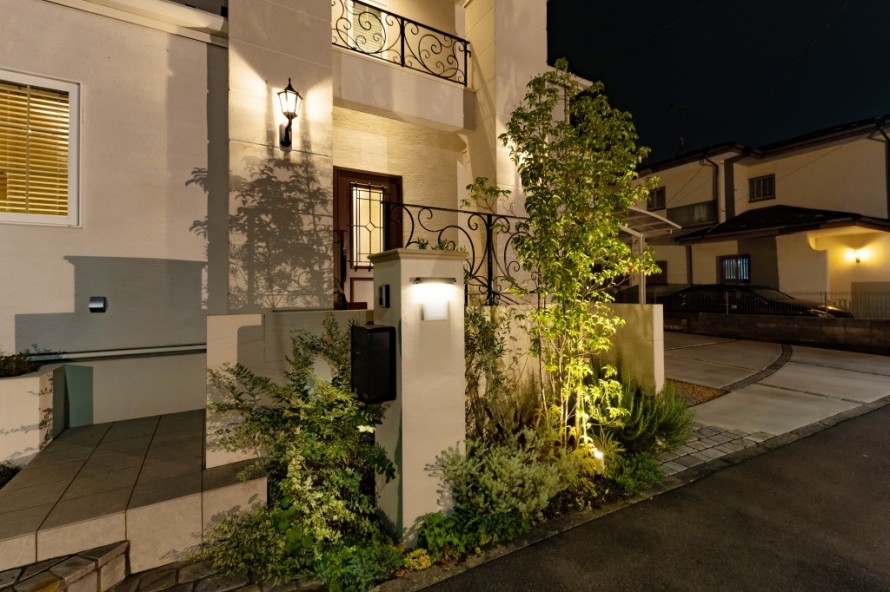
Around the gate
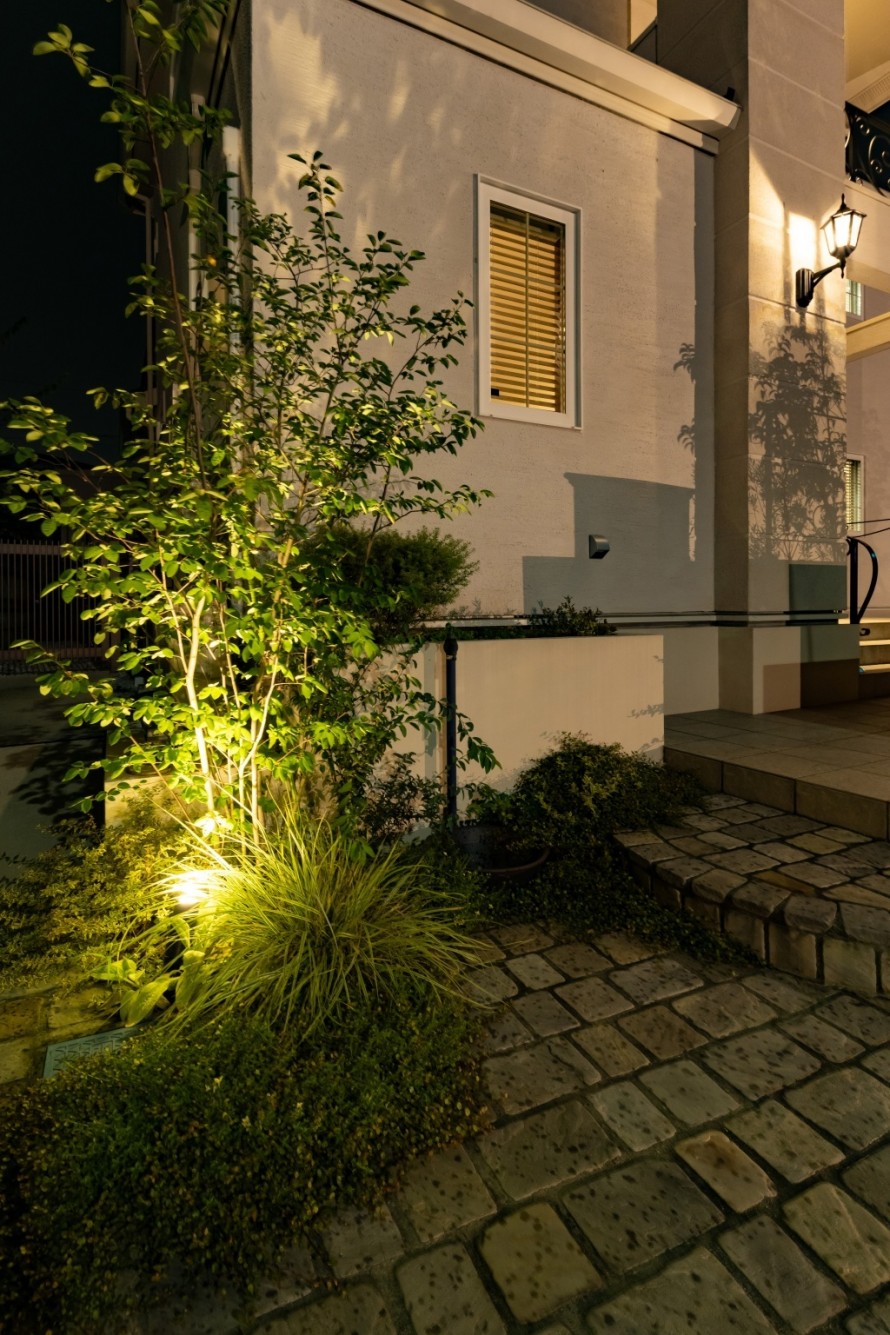
Lights overlap at the tree
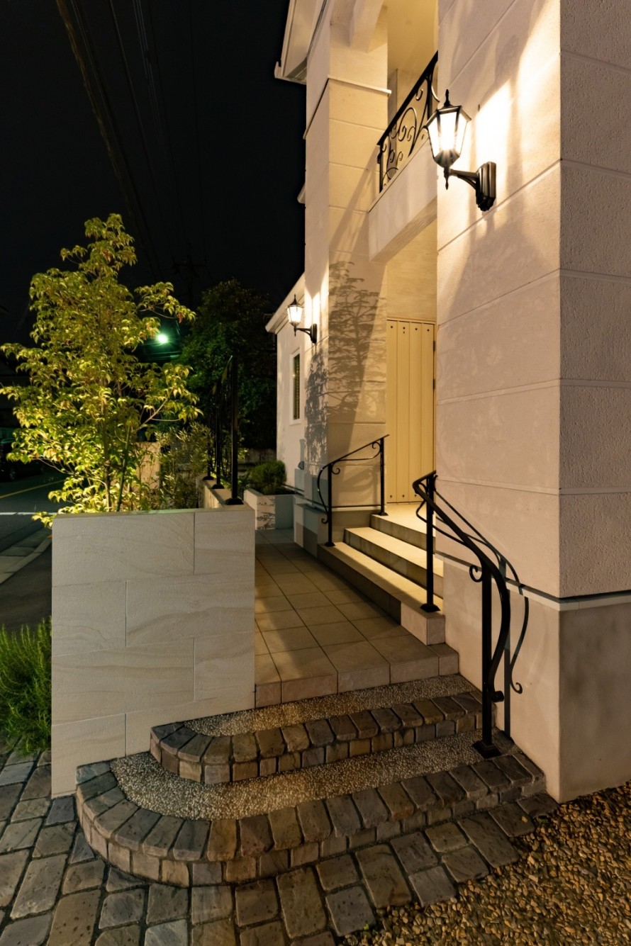
The bracket lighting on the building is wonderful.
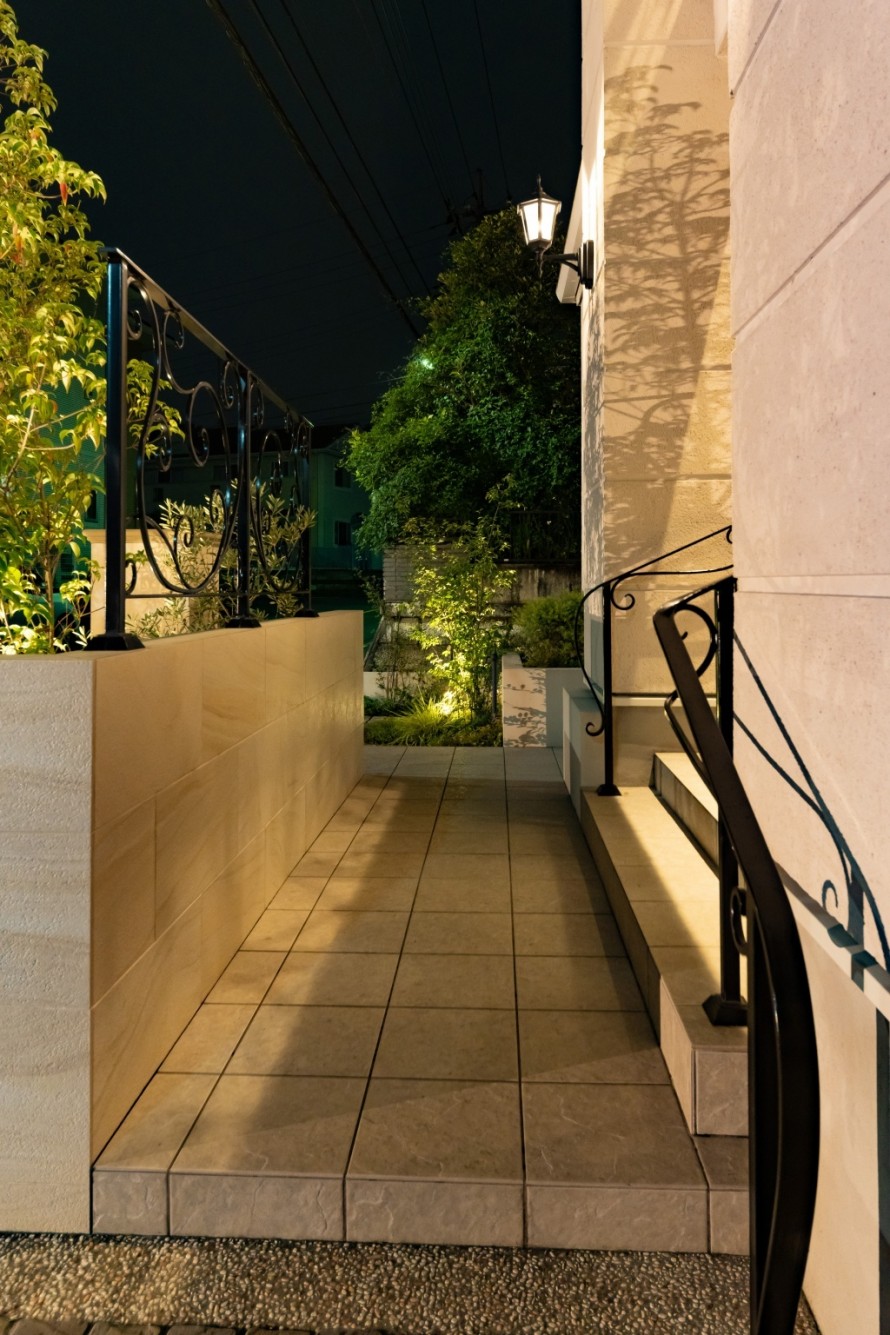
This is the nighttime view in front of the entrance.
This is the introduction of the new exterior of Mr. M's house in Hachioji City.
In order to create an ideal house, it is recommended to design the building, exterior and garden together.
It's a small detail, but it's possible to place the square on the ground without disturbing it.
This will prevent you from having an unattractive square in such a conspicuous place even though the design is good.
Please feel free to consult us about your exterior and garden needs.


